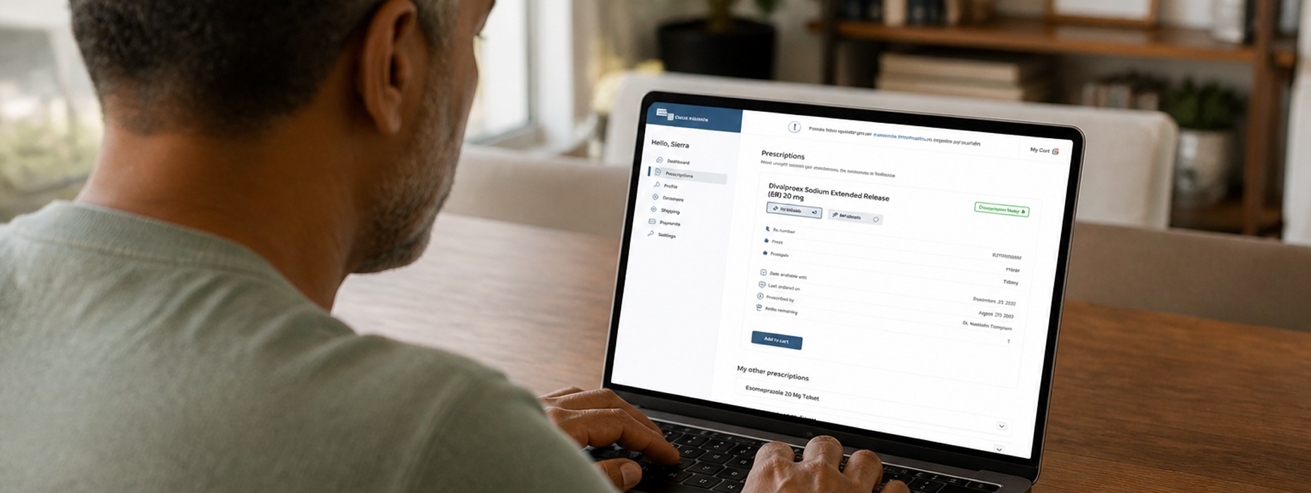
At Truepill, I led visual design for Virtual Pharmacy, a white-label healthcare platform built to help modern pharmacy brands launch digital customer experiences at scale. Working across product, UX, copy, engineering, and marketing, I helped shape a scalable system that could support multiple clients while still feeling trustworthy, accessible, and easy to use in a highly sensitive healthcare space.
What made the project especially meaningful was its real-world impact. The platform work helped support the launch of Mark Cuban’s Cost Plus Drug Company, with Truepill powering fulfillment as the experience scaled to a national audience. In a fast-moving moment for virtual care, I helped translate complex pharmacy flows into a cleaner, more human digital experience built for scale.

Client Portal: Flow
MVP (Phase I)
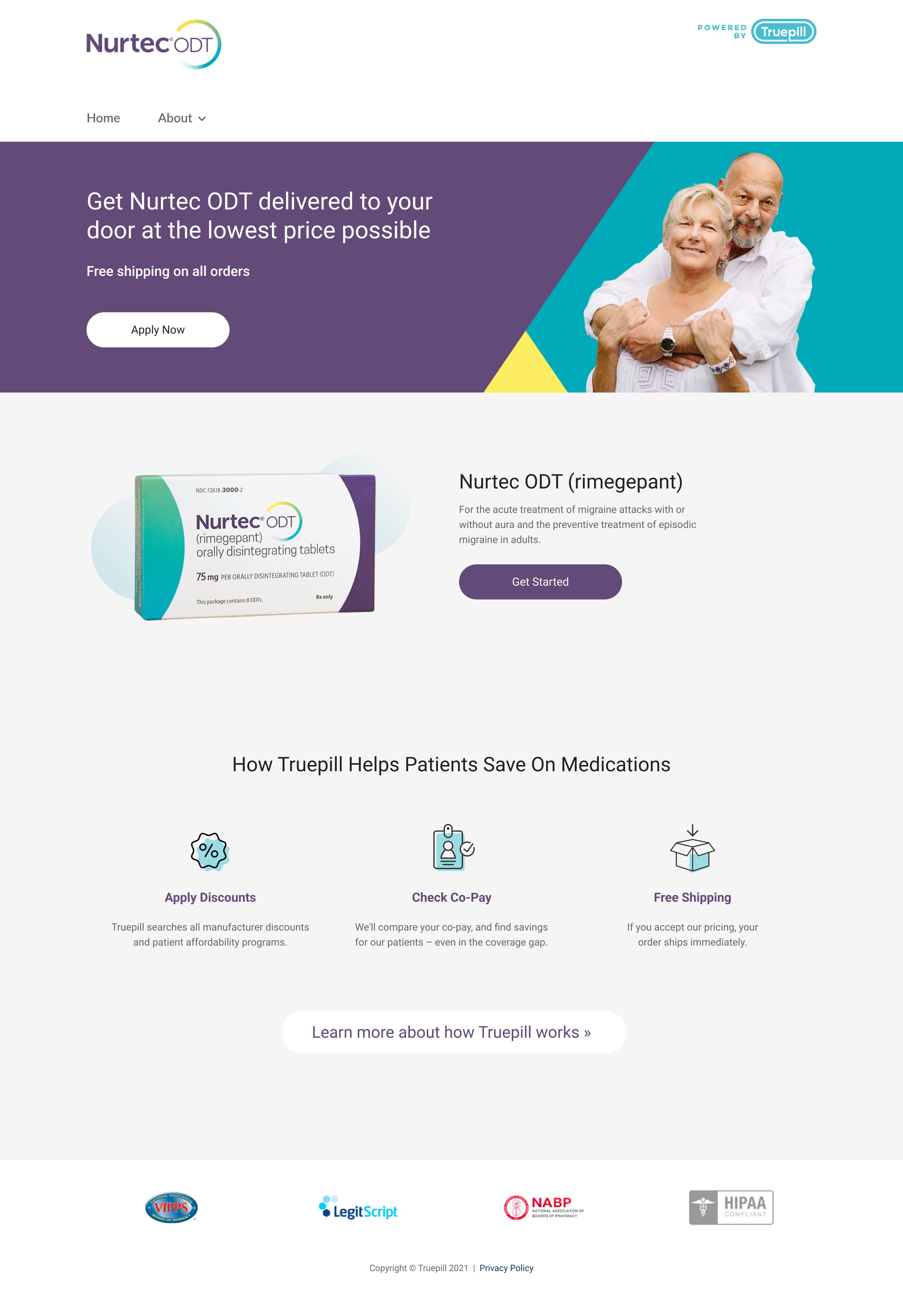
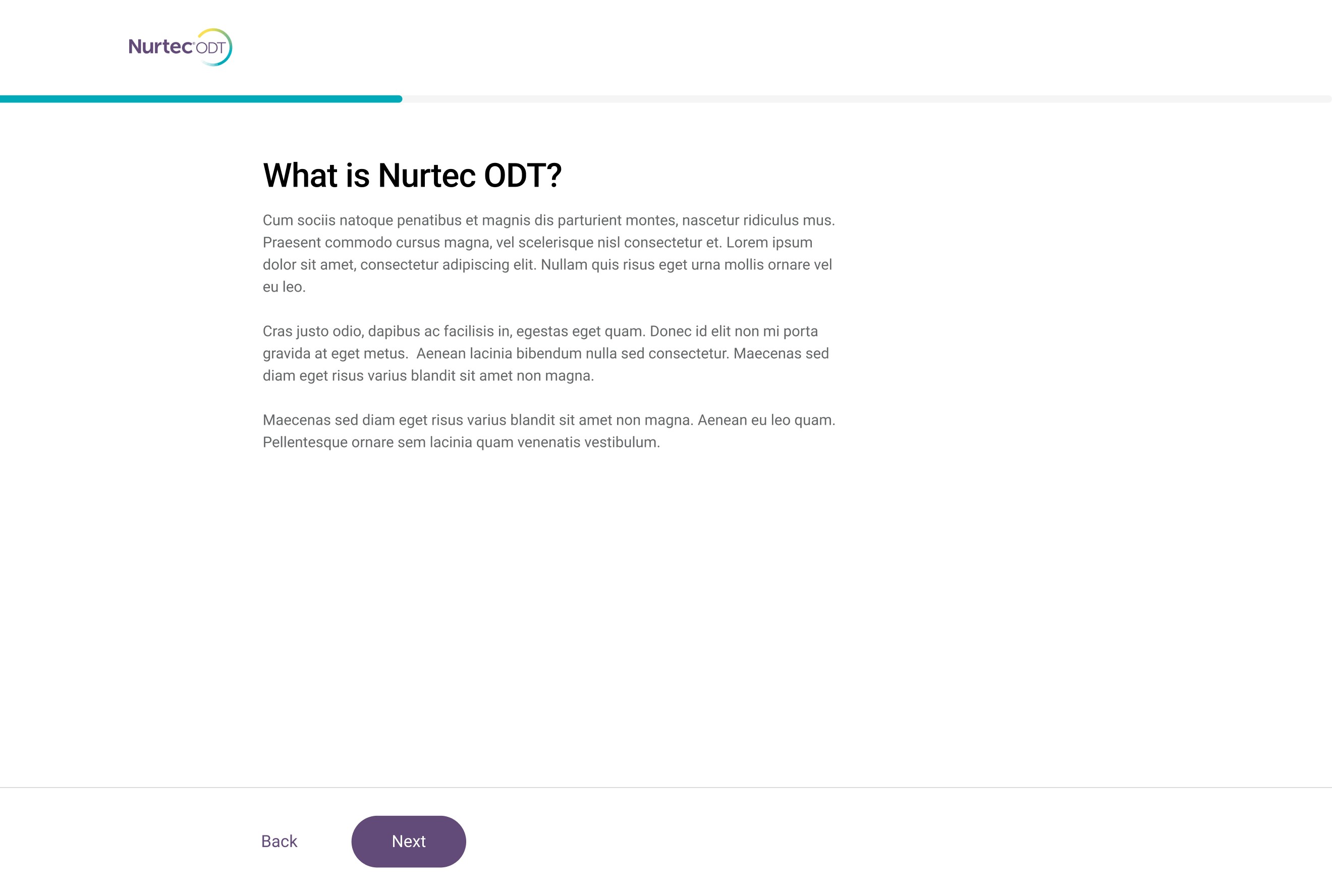
For the first phase of Virtual Pharmacy, I partnered closely with the UX and copy teams to develop an MVP designed for future pharma clients. Together, we created a white-label system that allowed each brand to launch a customized landing page and guided intake flow, making it possible to collect relevant health information and medication needs in a way that felt simple, clear, and credible for the end user.
Design System
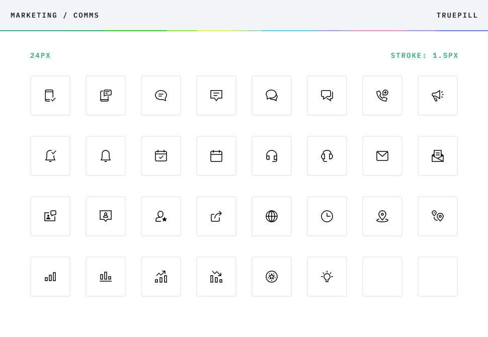
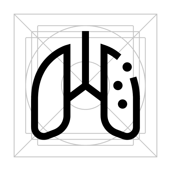
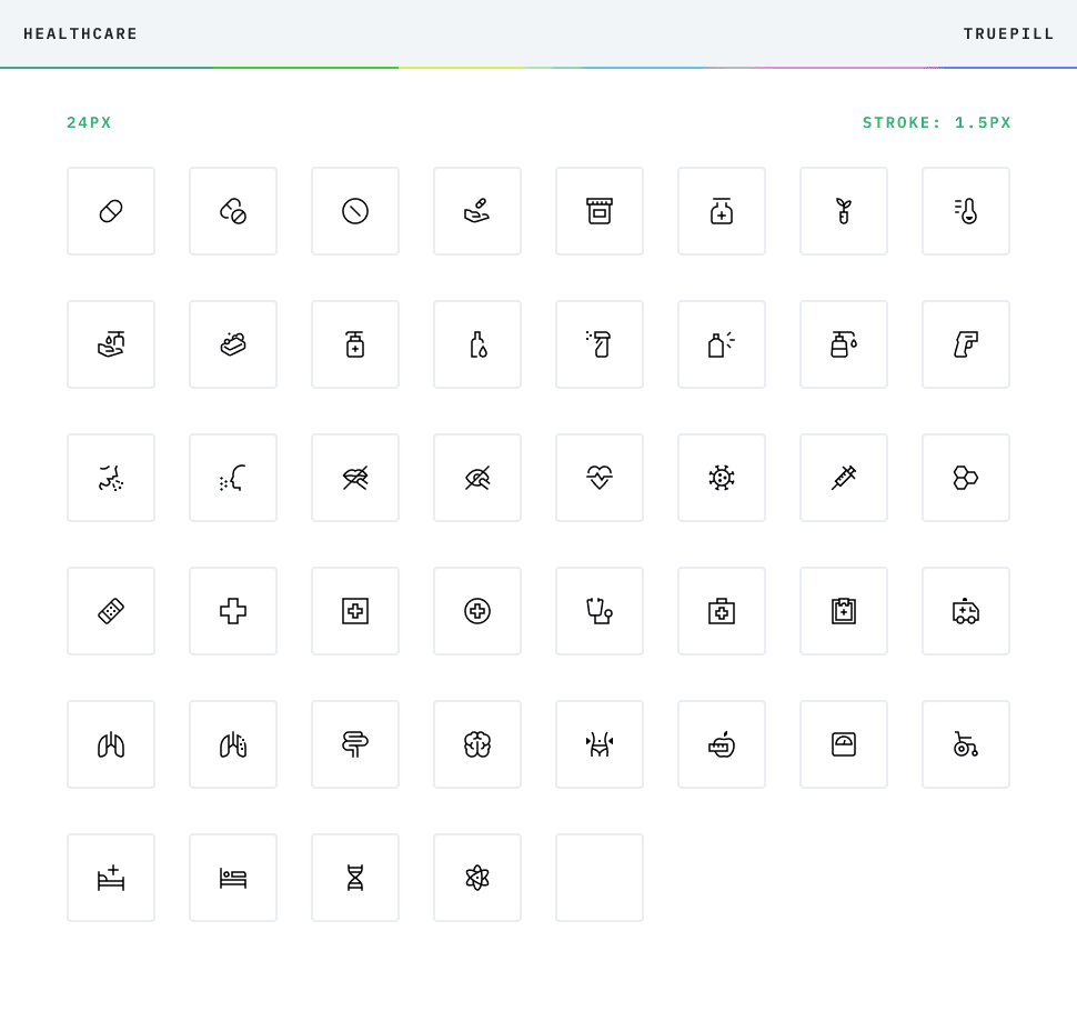
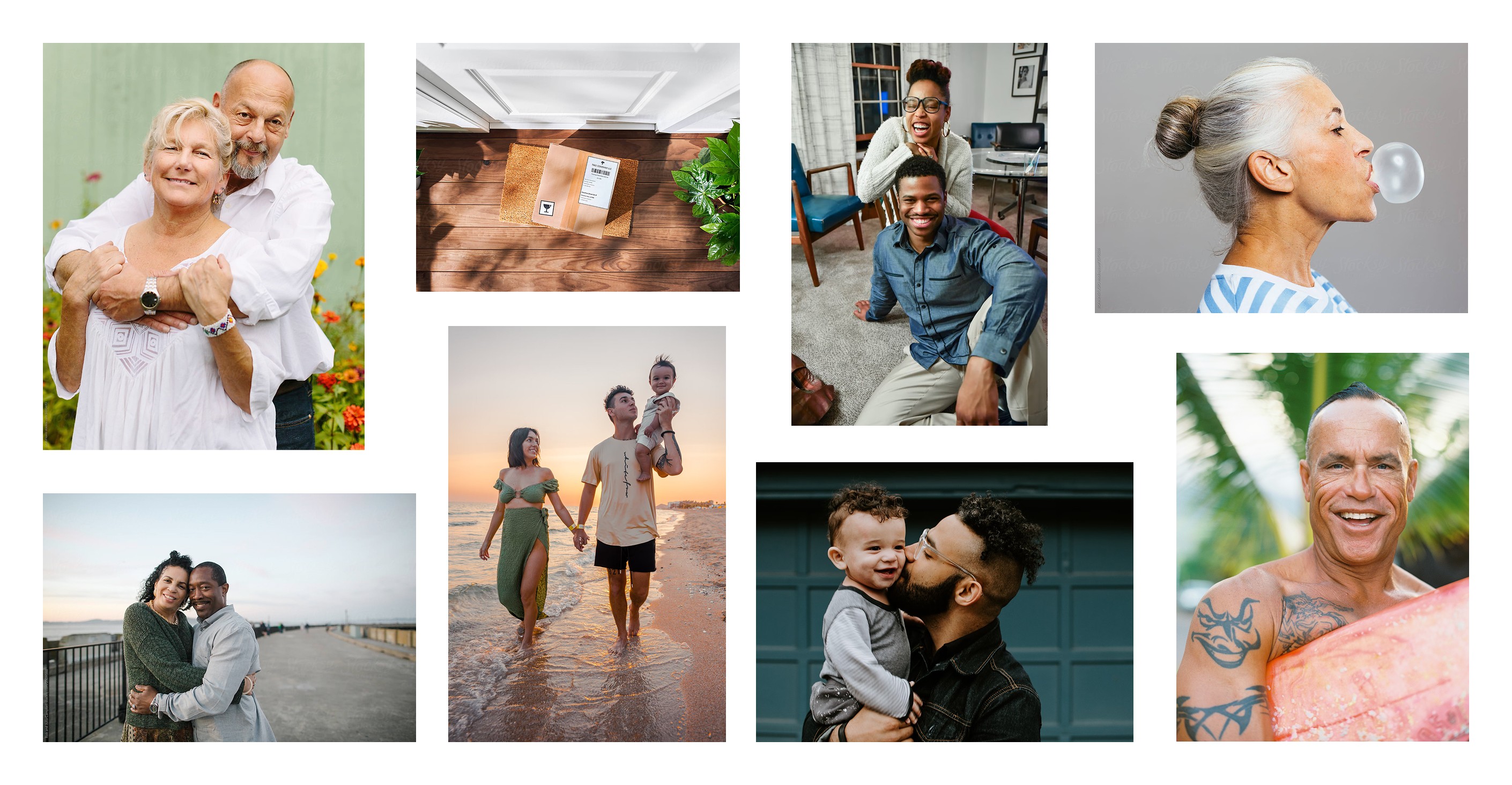
Icons, Colors, Layout, Type, Photography, Character Count
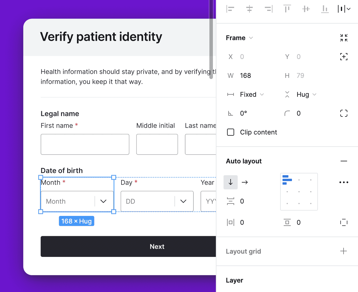
I built the visual design system for the Virtual Pharmacy experience, establishing the core UI language across typography, buttons, iconography, photography direction, and layout behavior. Inside Figma, I created flexible auto layout structures and reusable component libraries that helped the team move faster, maintain consistency, and scale the product across multiple branded applications.
Alternate Landing Pages
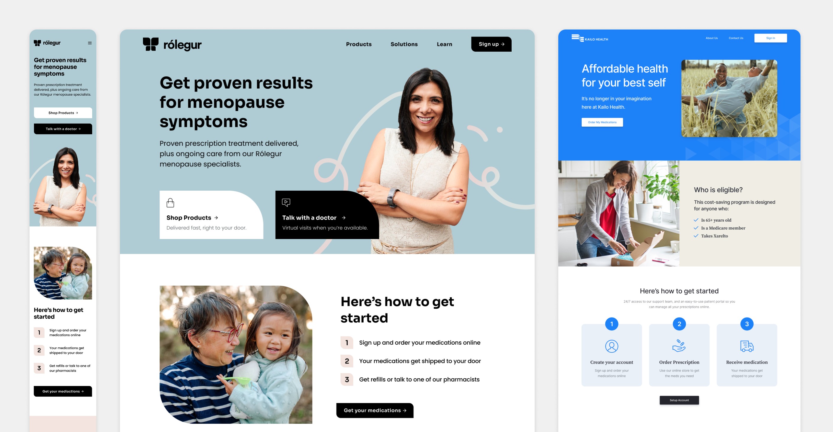
Rejected for MVP
While I built a full visual design system in Figma — covering typography, iconography, auto layout components, and photography direction — this level of uniqueness and visual candy was intentionally scoped out of the initial white label launch because it added too much complexity to prove the offering.
The MVP required a stripped-down landing page optimized for a single outcome: getting a customer to checkout and order their medications. We chose clarity over completeness for version 1.0, with the design system serving as a foundation to layer back in post-launch as the product expanded across branded applications.



A/B Testing
Copy, Layout
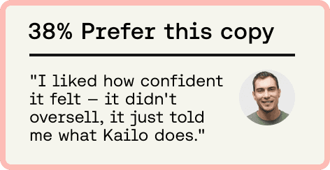
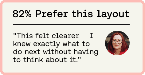
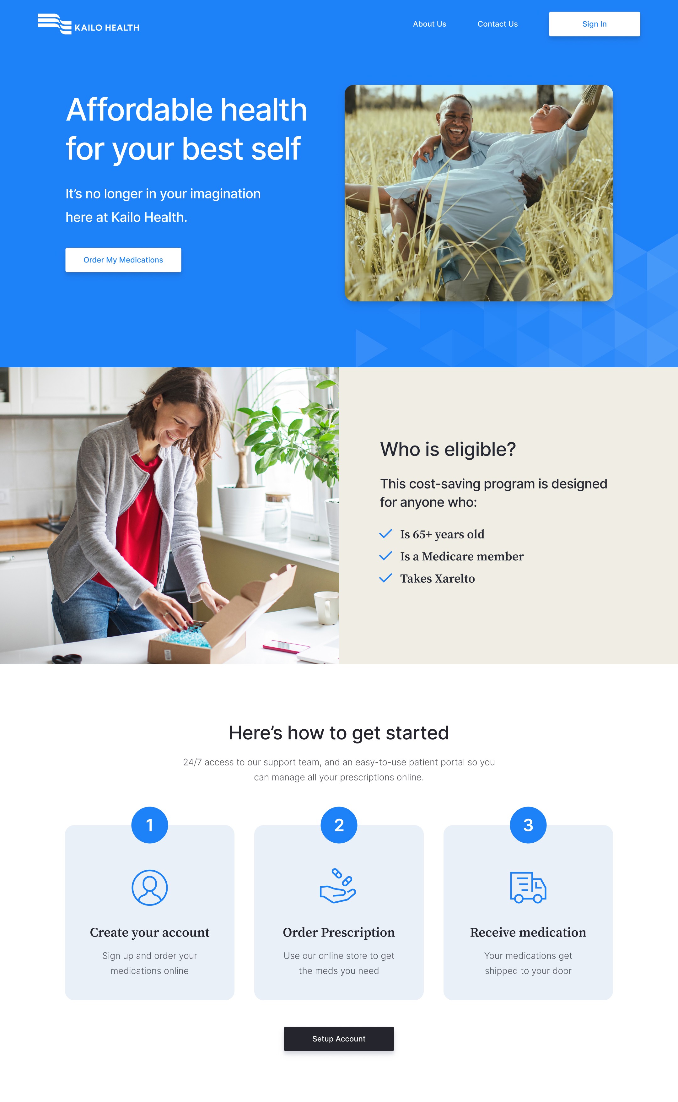
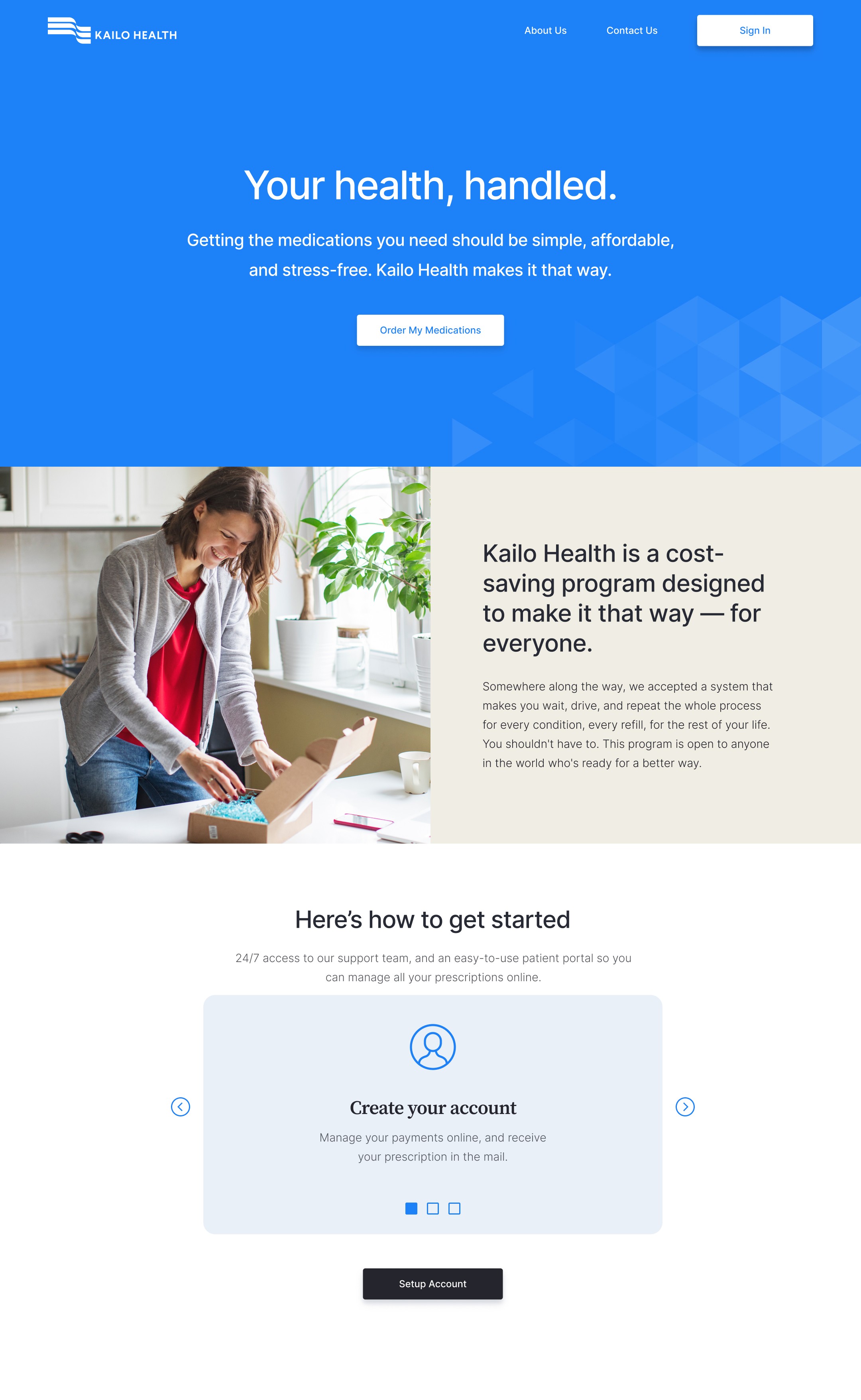
I also worked in close partnership with the copywriter to explore and test different messaging approaches and page layouts for the white-labeled landing pages. Through iterative design exploration and A/B testing, we gathered performance insights that helped refine the customer journey and inform the final MVP with stronger clarity, usability, and conversion potential.
Client Portal: Dashboard
Phase II
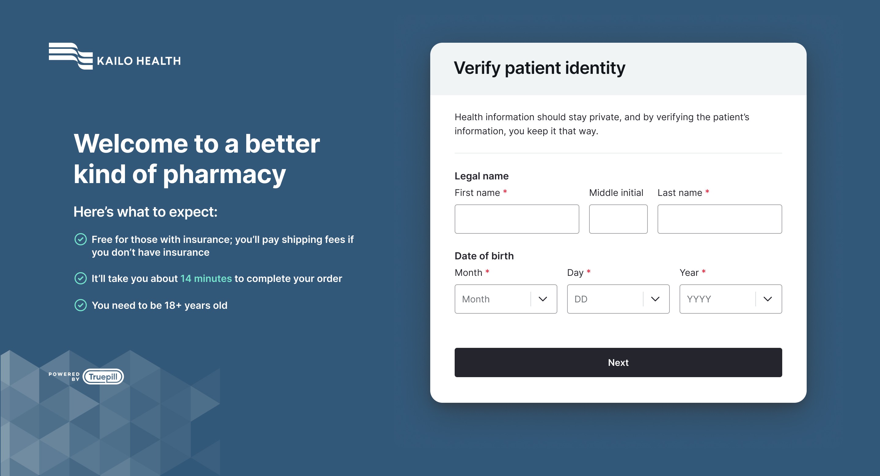
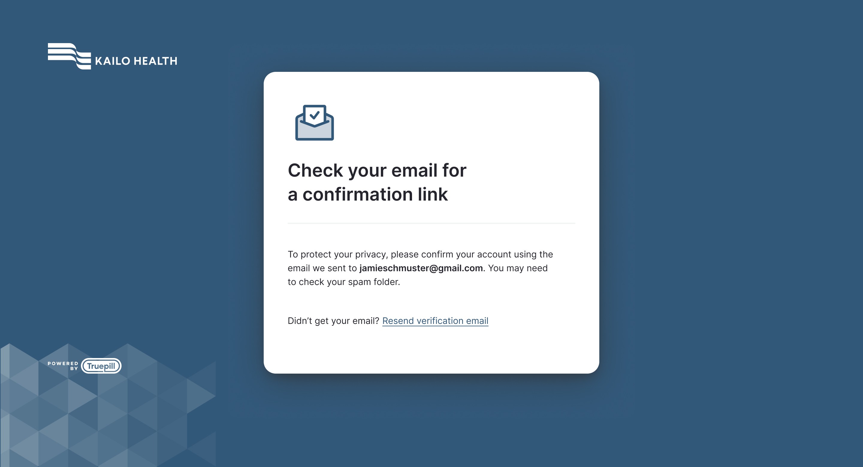
After the initial MVP was established, I continued working with the UX team to design the fuller end-to-end experience, including the client portal dashboard where users could manage and continue ordering their medications online. This phase focused on extending the original system into a more complete product experience, giving customers a clearer, more seamless interface for ongoing engagement while preserving consistency across the broader platform.
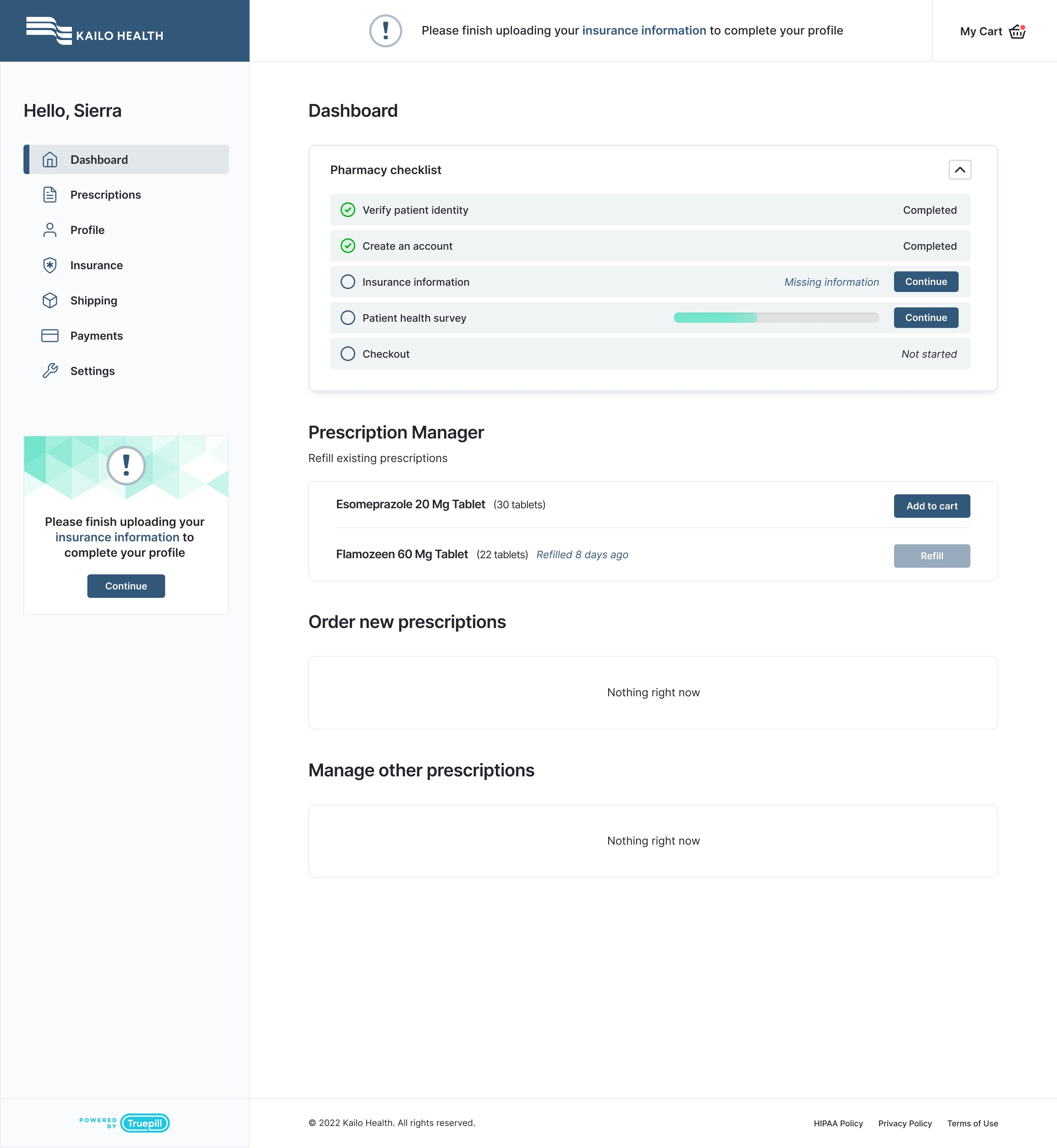
Spruce Labs
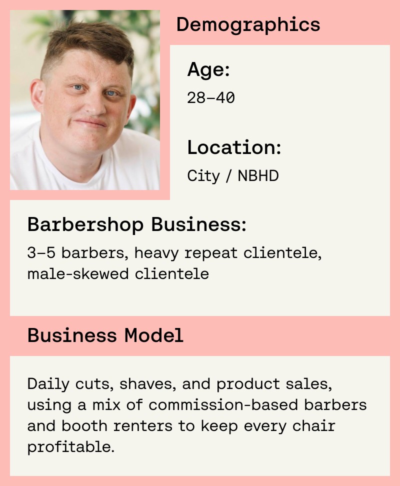
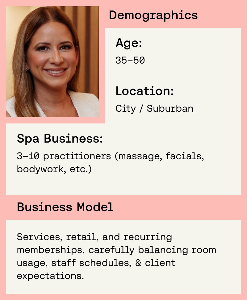
At Spruce Labs, I worked directly with founder Taylor Romero to help design a new app built for small business owners in service-based industries, specifically spas, barbershops, and salons. The goal was to create a modern platform that made it easier for owners to manage bookings, organize their teams, and run more of their business from a single app experience without sacrificing simplicity or speed.
What made the project especially exciting was how early and forward-looking it felt. In addition to building around detailed personas for spa, barbershop, and salon owners, we were also shaping a virtual assistant experience that helped businesses get up and running quickly by guiding setup, services, pricing, bookings, calendar management, VIP offerings, revenue tracking, and operational insights. The MVP gained meaningful traction, with both Sephora and Ulta Beauty buying and licensing the product for use in their stores, and Ulta publicly described testing a Spruce Labs mobile program to improve appointment check-in and salon schedule management.

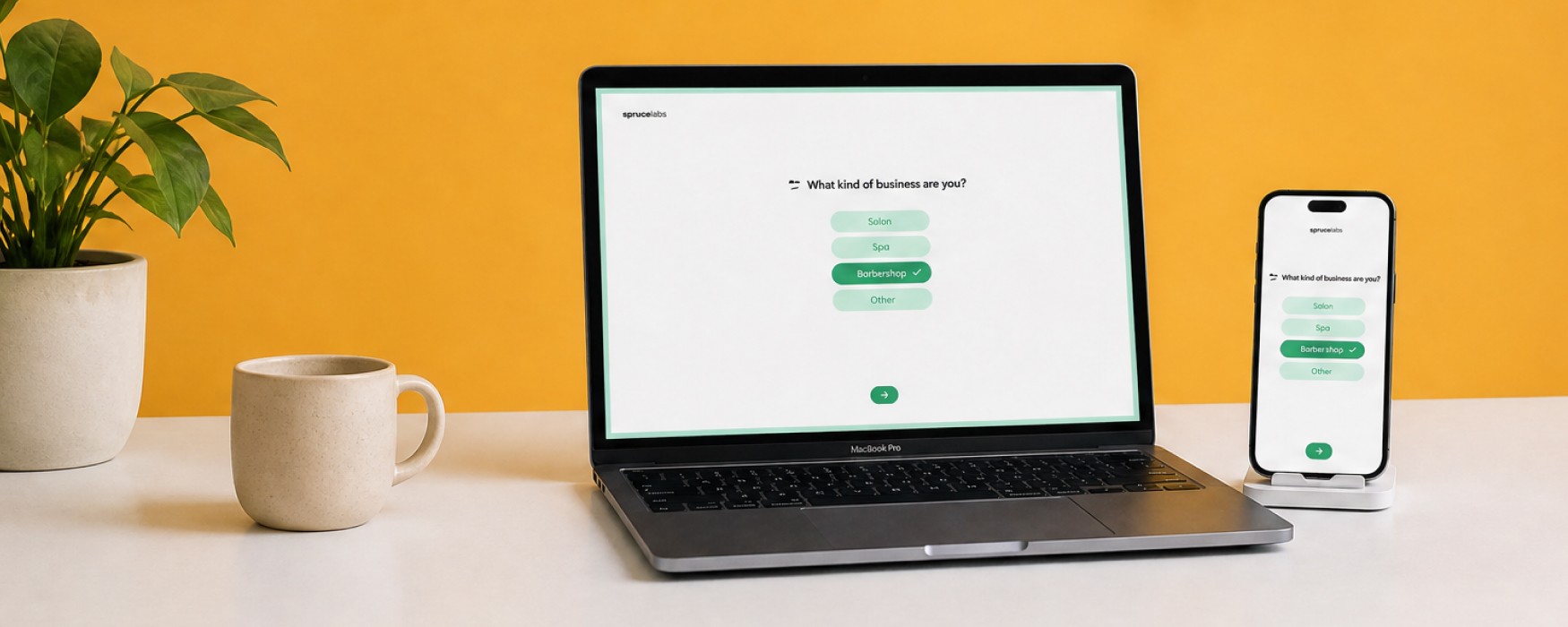
Creating Personas from Interviews
Insight
Insight
Insight
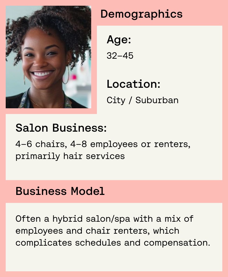
Goals
Pain Points
Behaviors
Business Setup Flow
UX, UI Layout, Design System
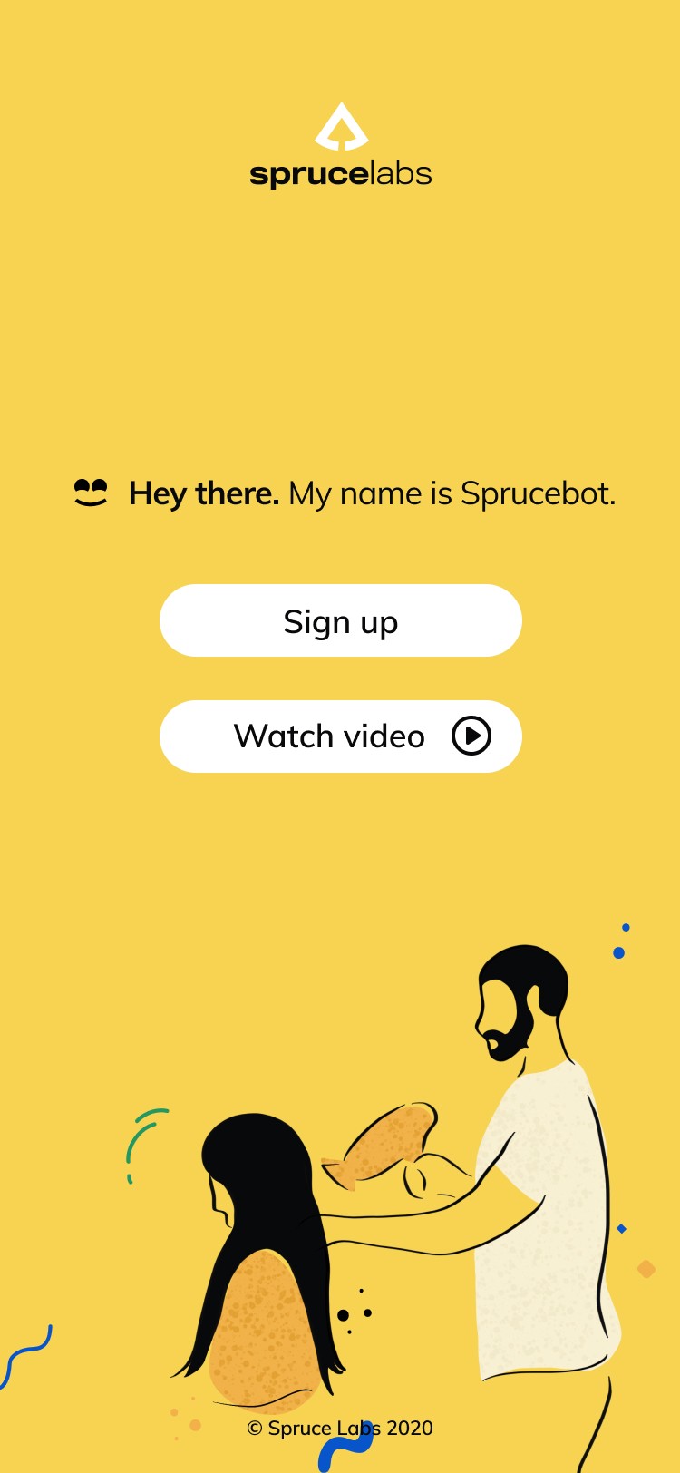
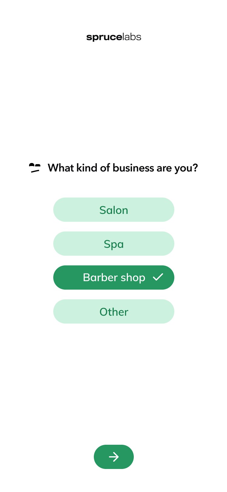
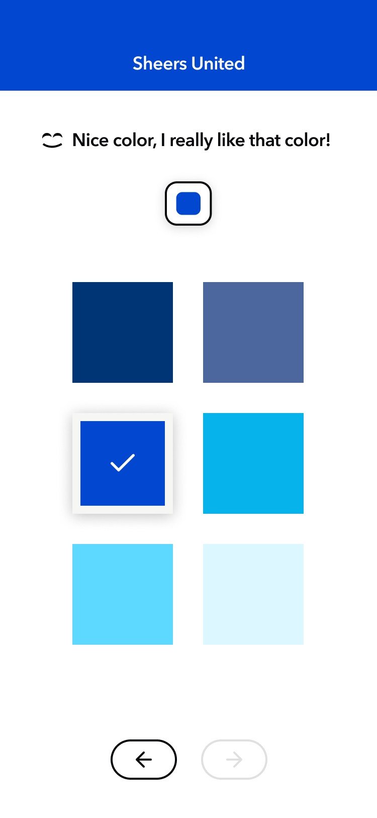
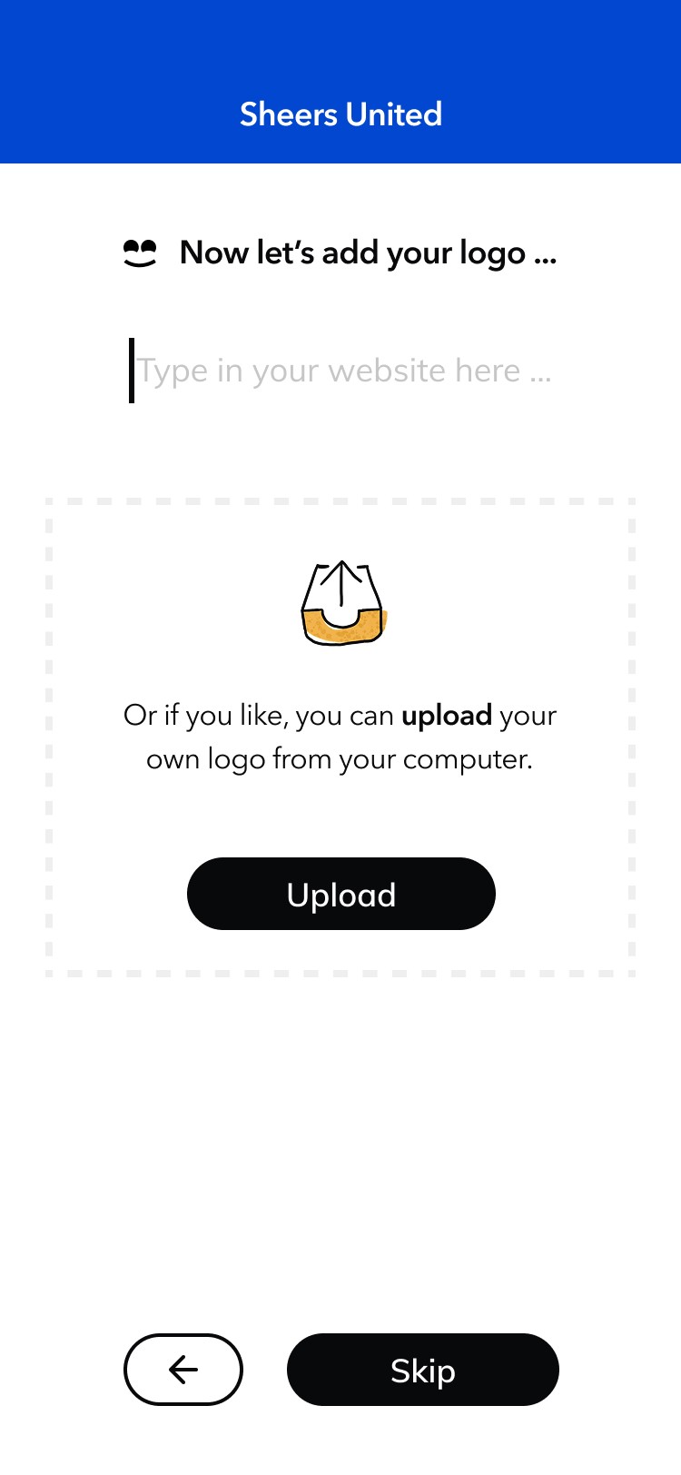
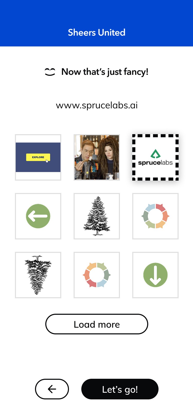
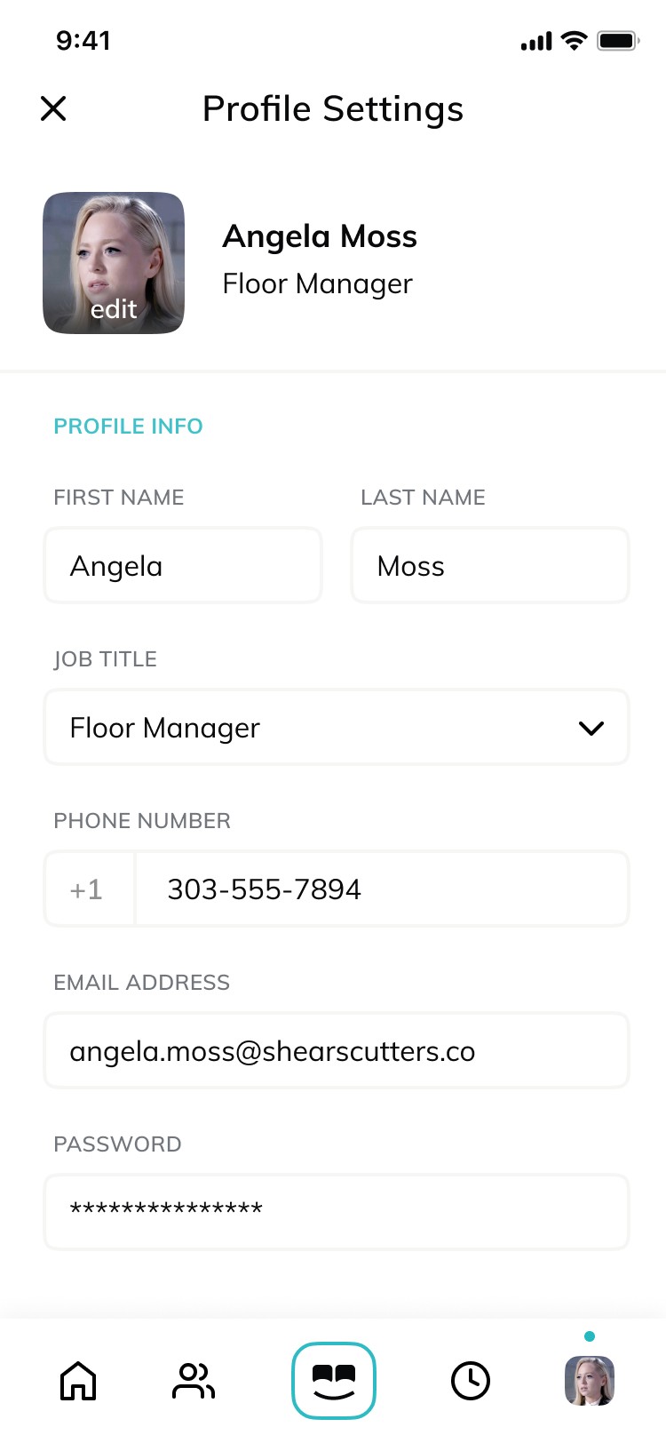
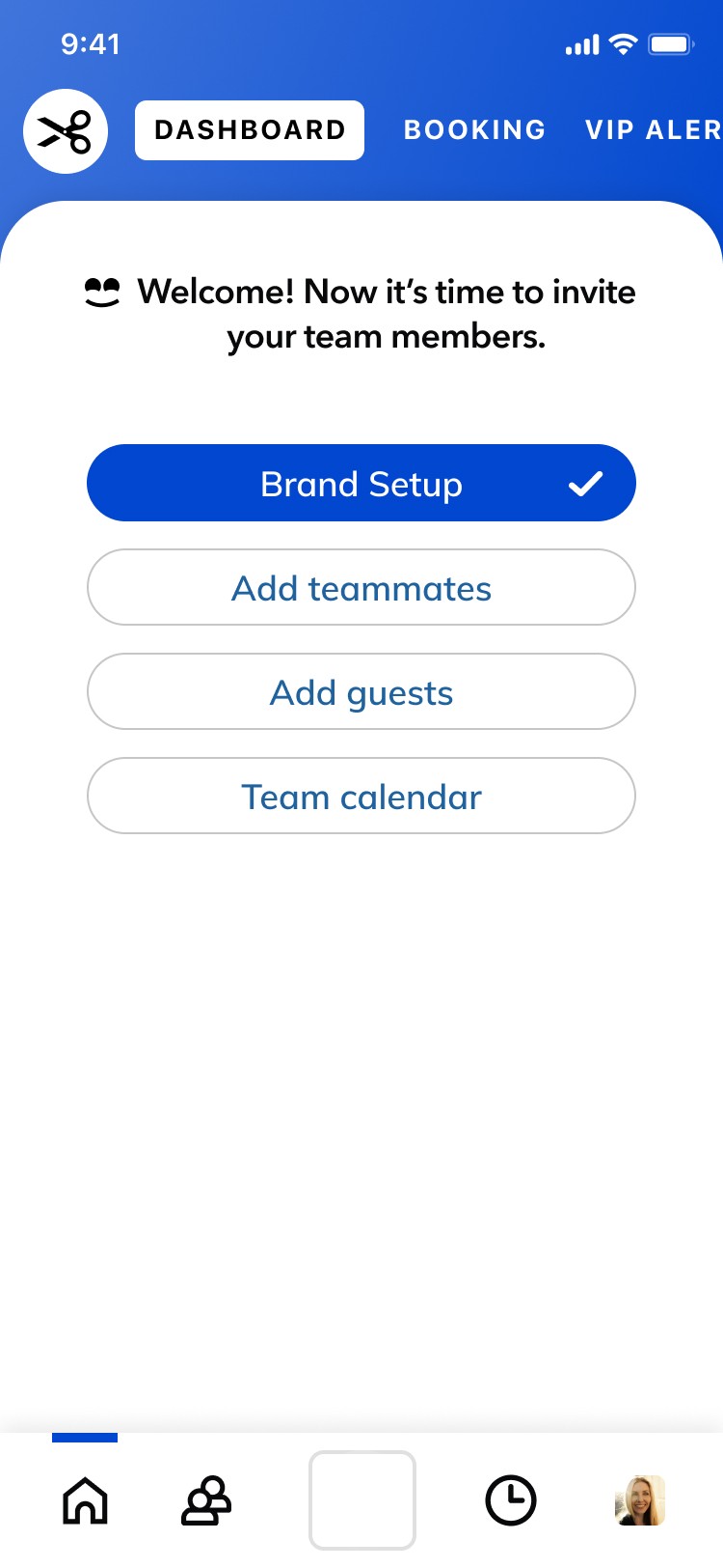
I led the UX and visual design for the business setup flow, creating an onboarding experience that helped owners launch their business quickly through a white-label system tailored to their brand. The flow guided users through essentials like logo upload, brand colors, services, pricing, bookings, and business details, while I designed the full interface across both desktop and mobile to keep the experience clear, flexible, and easy to adopt.
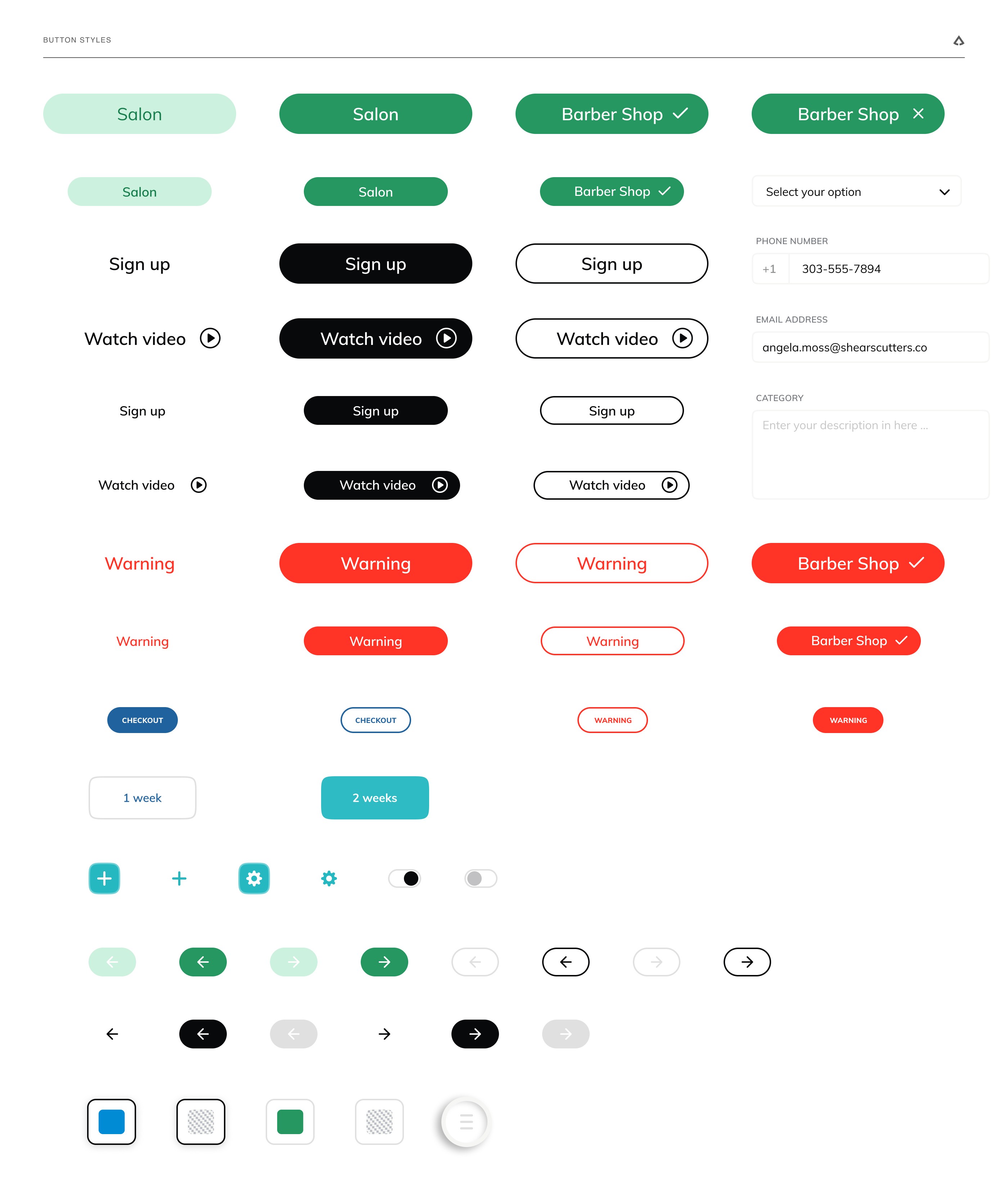
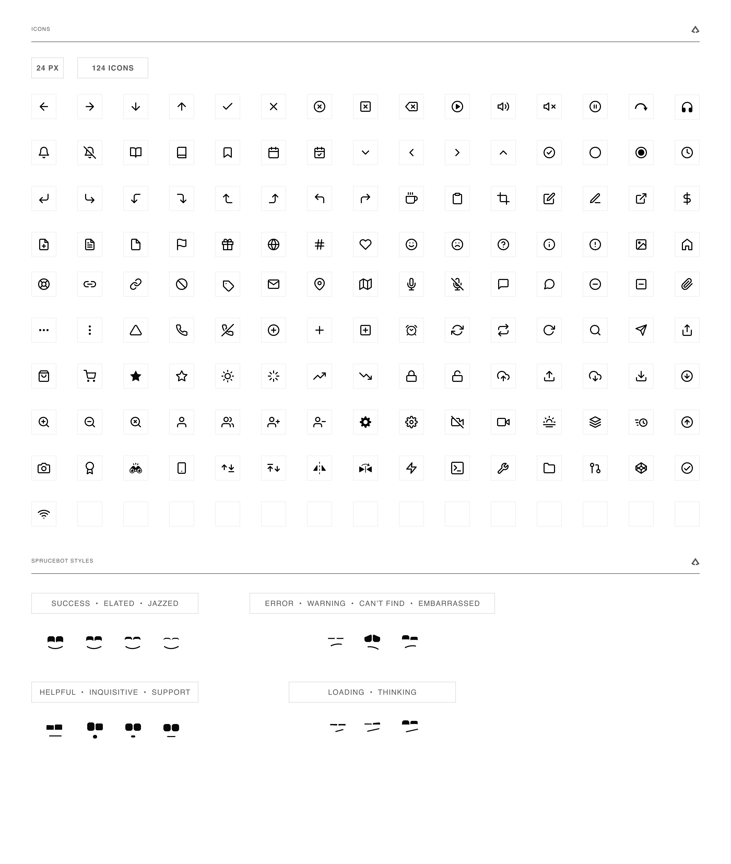
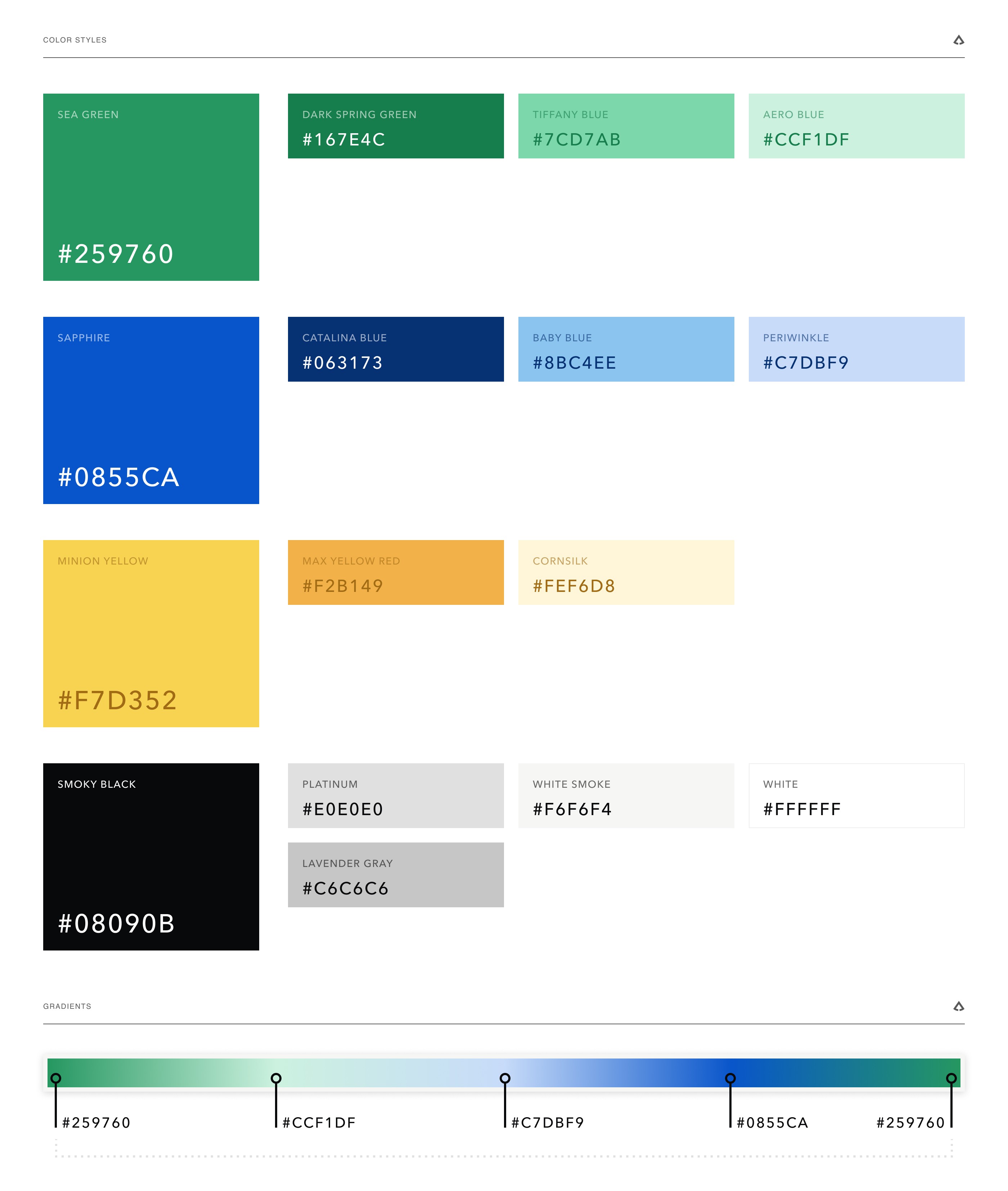
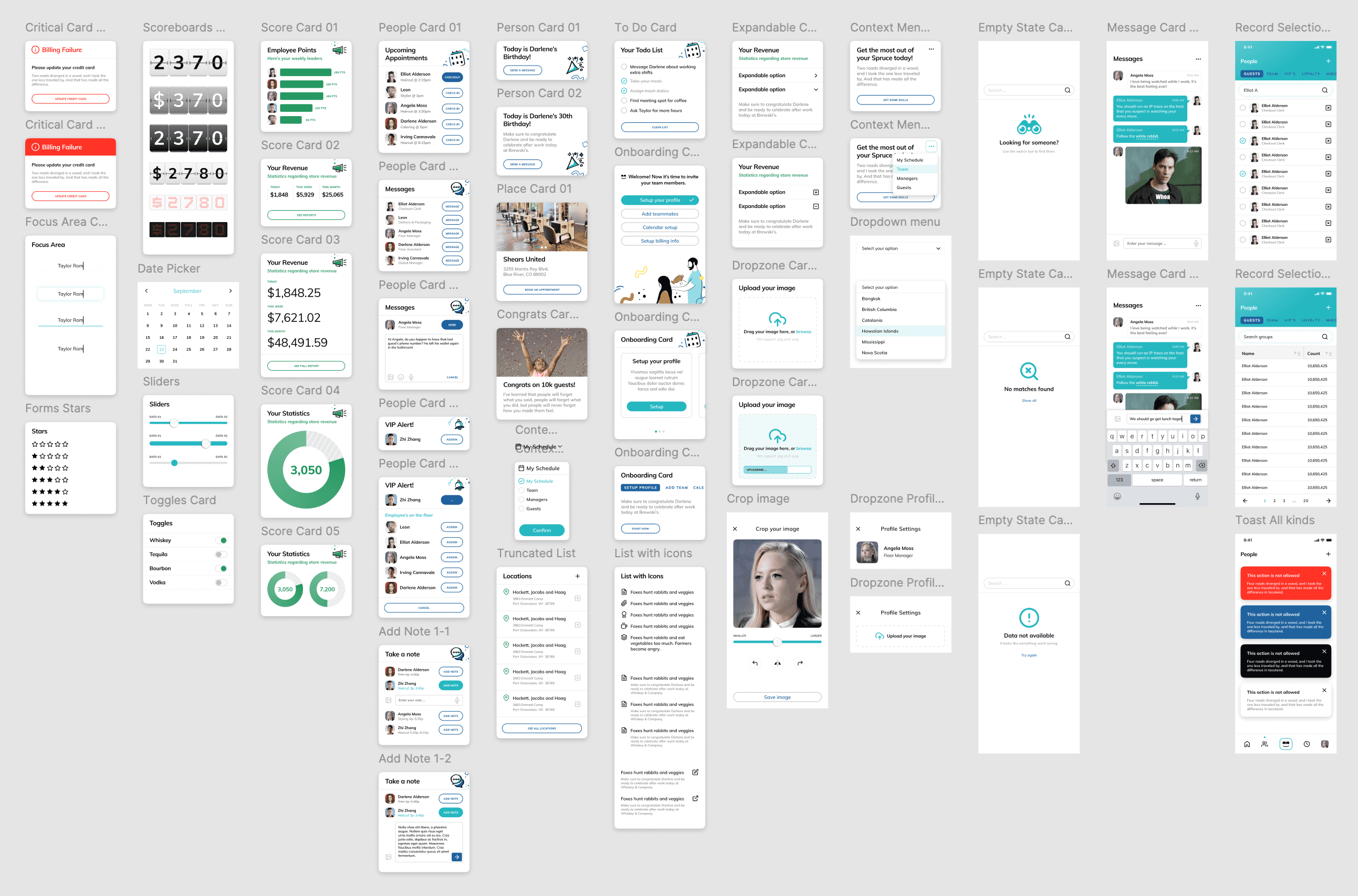
As part of that work, I created the button system, icon set, and reusable UI patterns that gave the product a consistent visual language from first-time setup through daily use. The system was designed to scale across different business types while still feeling approachable for independent owners who needed powerful tools without the complexity of enterprise software.
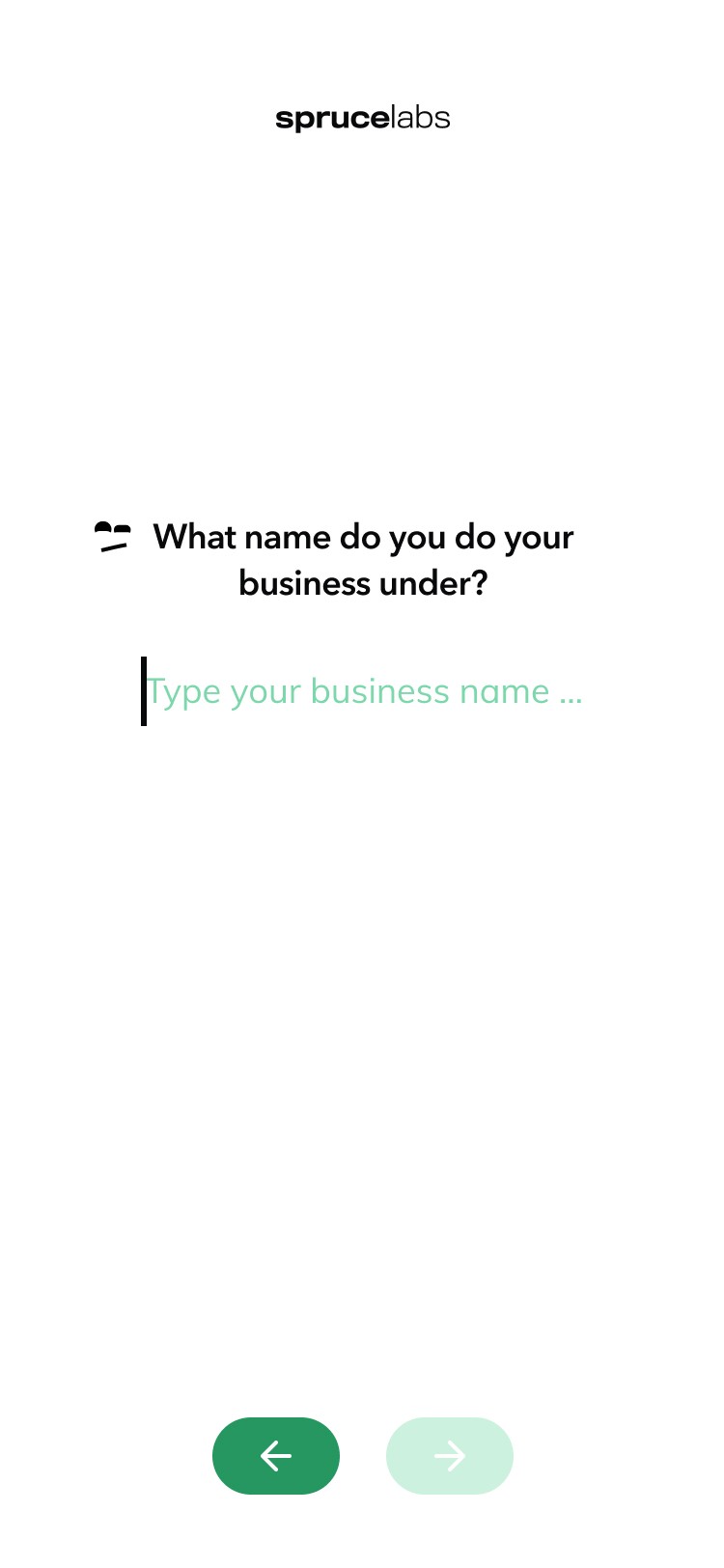
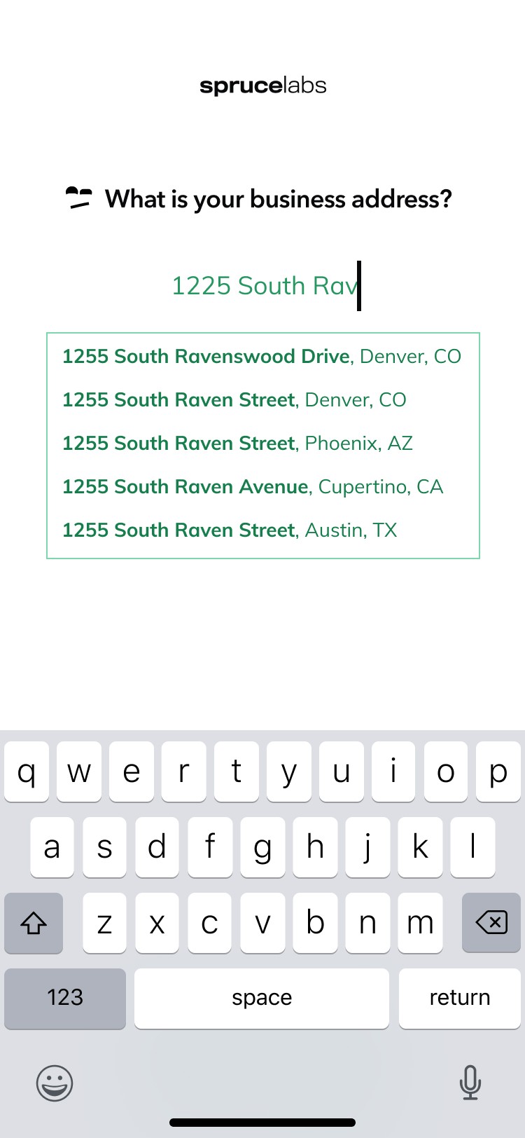
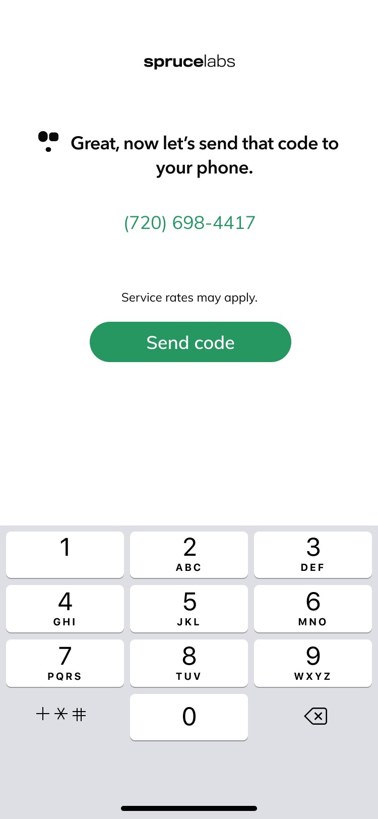
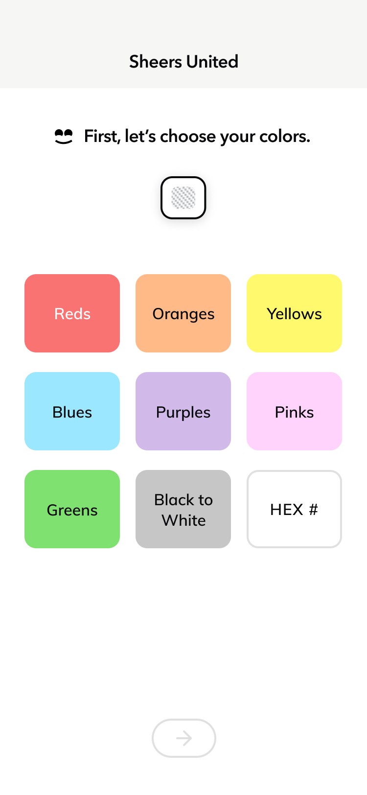

Business Creation, Card Designs, and Team Members
UX, UI Layout
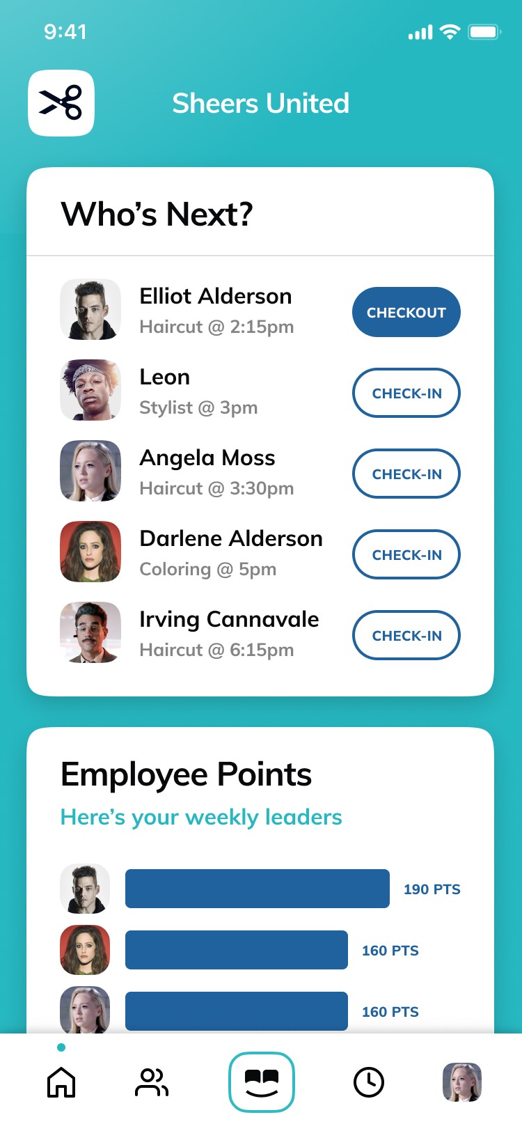
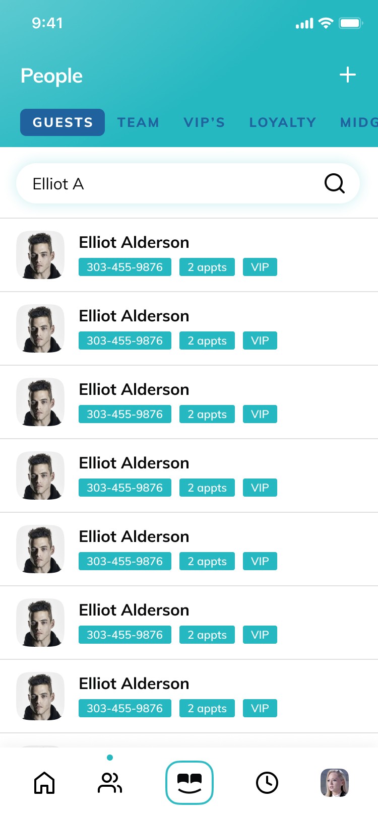
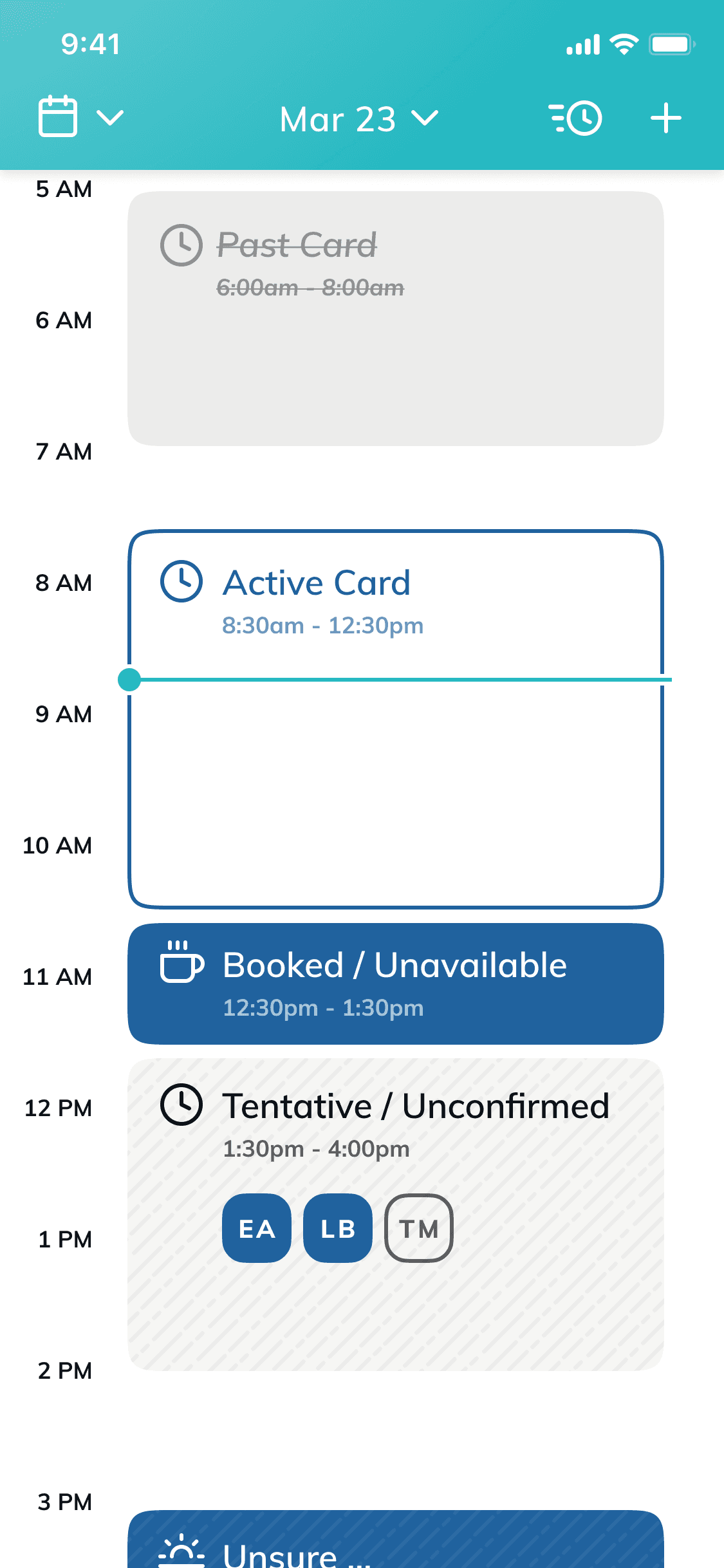
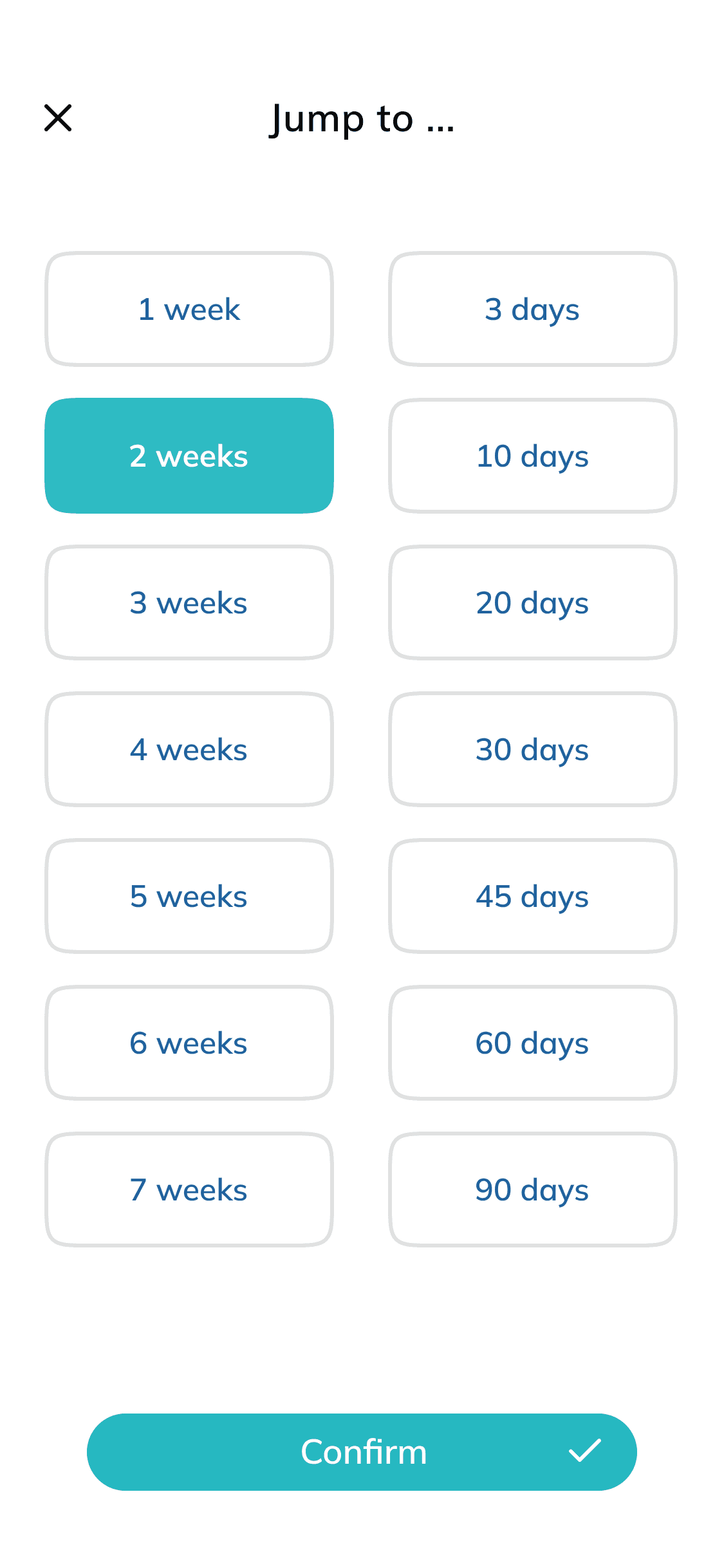
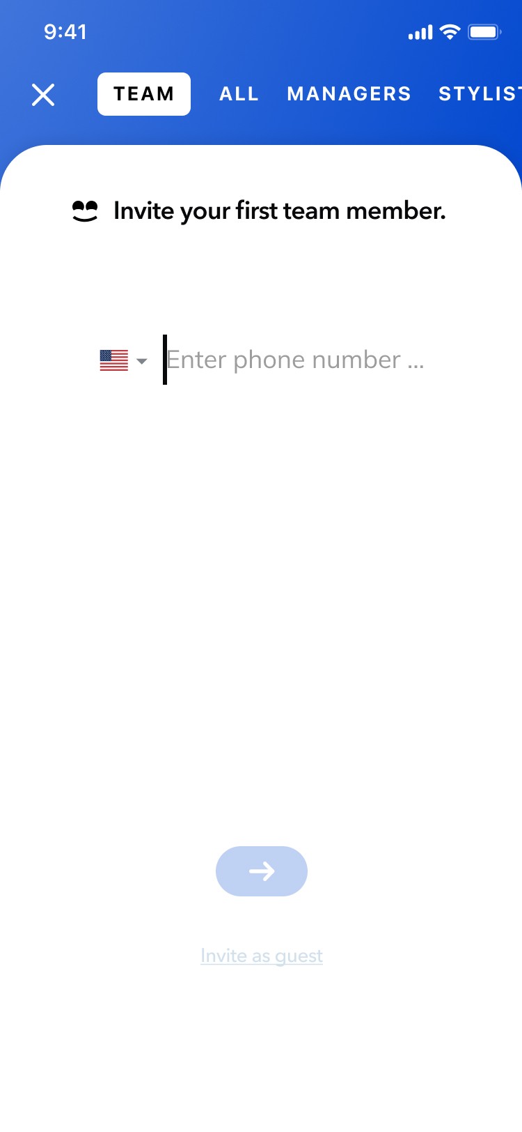
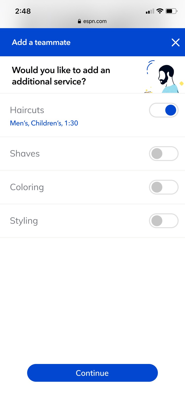
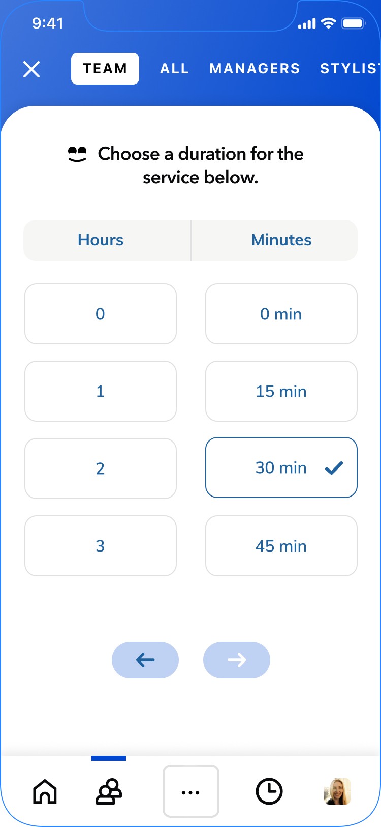
I also designed the app experiences tied to business creation, team management, and day-to-day scheduling operations. This included card systems for showing which client each team member had next, who had already checked in, detailed guest information such as name, service, timing, and contact details, as well as team calendars and booking views that made it easier for businesses to manage traffic throughout the day.
A major part of the challenge was designing card patterns and interface states for every possible scenario the product needed to support. I built those components to be flexible, readable, and operationally useful, allowing the app to support everything from single-location businesses to larger teams with more advanced scheduling and service needs.
Screenshop
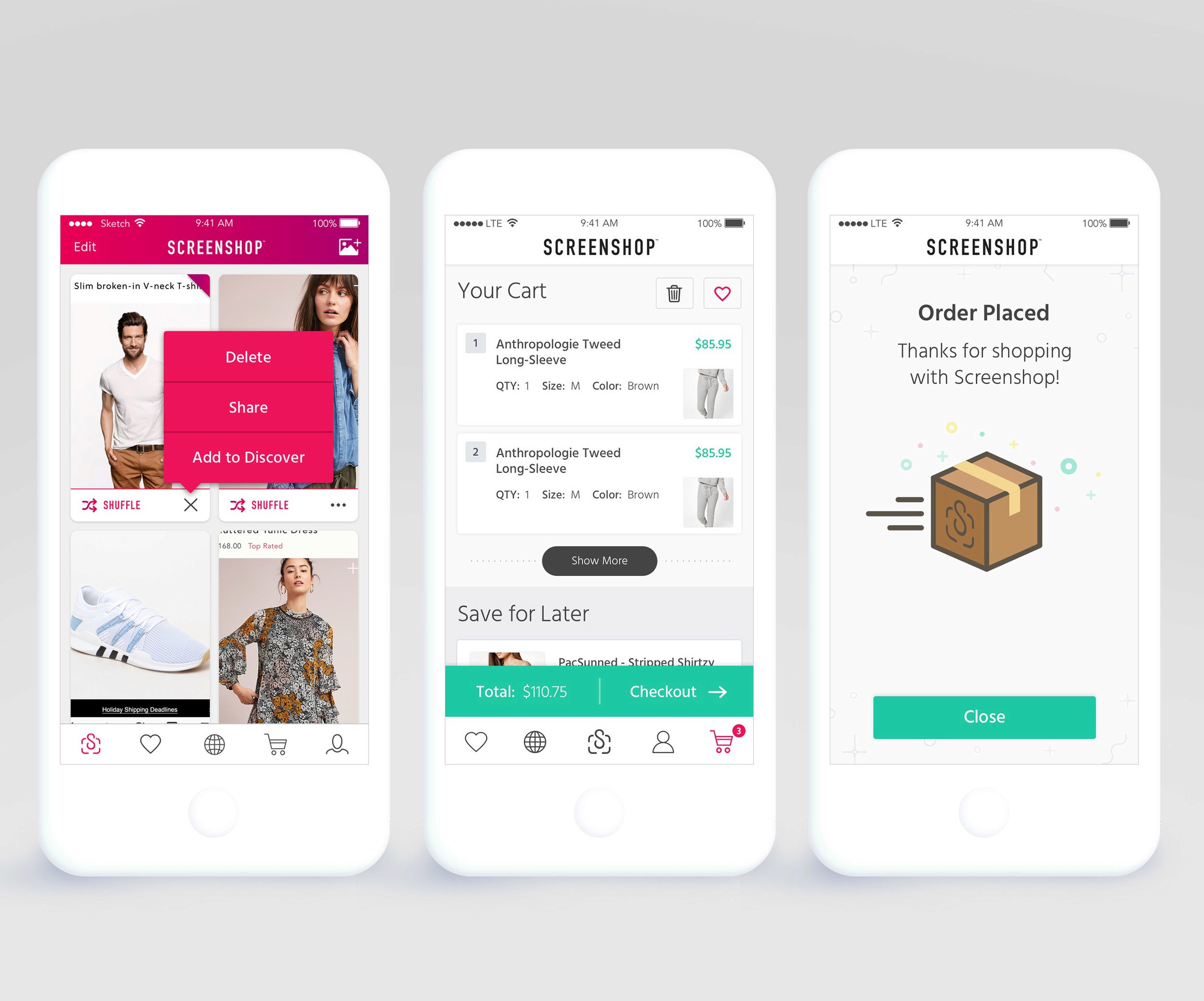
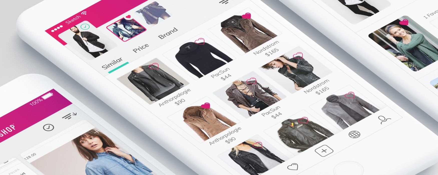
At Screenshop, I worked with the Head of Product and the co-founders across New York City and Israel to help shape a product that turned inspiration into instant commerce. The idea was simple and powerful: take a screenshot of a look you love, open the app, and Screenshop immediately surfaces visually similar items you can shop across different brands and price points. As the visual designer on the product, I created the core comps for these experiences and helped evolve the app into something that felt more personalized, engaging, and conversion-focused at a time when visual search and social shopping were beginning to reshape the retail landscape.
The momentum around the product made the work even more exciting. Screenshop earned major visibility through Apple App Store editorial placement, while Kim Kardashian helped bring early cultural attention to the app and its “shop your screenshot” concept. Within that momentum, I worked closely with product leadership to explore features like onboarding for a more personalized feed, notification-driven engagement, brand search, curated collections, and shopping discovery, while also using design to communicate when a request might create friction for users or require more complexity than it first appeared. That balance of strong visual thinking, product judgment, and clear collaboration was a big part of how I contributed to the team.

Creating a New UI for a New Experience
Research for Engagement
For Screenshop, I explored engagement patterns that felt modern for 2018 by focusing on fast, low-friction decisions that helped users shape a personal style profile over time. Rather than forcing a heavy shopping flow too early, I looked at intuitive actions like add, pass, and favorite to make browsing feel more like training the product to understand the user’s taste, while also creating clearer paths to save items for later, revisit standout products, and get notified when favored pieces went on sale.


A Complete Shopping Experience